Advice?
+3
No Frills
iJUSTIN
Vertigo
7 posters
C&C my most recent work!
Vertigo- Administrator
- Posts : 91
Points : 134
Join date : 2010-01-31
Location : Texas
- Post n°1
C&C my most recent work!
Advice?
iJUSTIN- New User
- Posts : 68
Points : 92
Join date : 2010-02-04
Age : 32
Location : FLORDIA
- Post n°2
Re: C&C my most recent work!
eeewww l2gfx newb
No Frills- New User
- Posts : 22
Points : 33
Join date : 2010-02-04
- Post n°3
Re: C&C my most recent work!
Honestly, I cannot find anything wrong with this signature. It looks amazing. Job well done.
Vertigo- Administrator
- Posts : 91
Points : 134
Join date : 2010-01-31
Location : Texas
- Post n°4
Re: C&C my most recent work!
No Frills wrote:Honestly, I cannot find anything wrong with this signature. It looks amazing. Job well done.
I've got one! The text is meh. Thanks though ^^
iJUSTIN- New User
- Posts : 68
Points : 92
Join date : 2010-02-04
Age : 32
Location : FLORDIA
- Post n°5
Re: C&C my most recent work!
i like it tbh..
Euphoria- New User
- Posts : 89
Points : 119
Join date : 2010-02-05
Age : 30
Location : Belgium
- Post n°6
Re: C&C my most recent work!
Only thing I don't like is the Text.
The rest is perfect.
iJUSTIN- New User
- Posts : 68
Points : 92
Join date : 2010-02-04
Age : 32
Location : FLORDIA
- Post n°7
Re: C&C my most recent work!
yeah the text is a little blurred
Aeon- Moderator
- Posts : 65
Points : 85
Join date : 2010-02-04
- Post n°8
Re: C&C my most recent work!
Work on the text. and lol @ justin's contradiction.
Stock plz? for comparison
Vertigo- Administrator
- Posts : 91
Points : 134
Join date : 2010-01-31
Location : Texas
- Post n°9
Re: C&C my most recent work!
Aeon- Moderator
- Posts : 65
Points : 85
Join date : 2010-02-04
- Post n°10
Re: C&C my most recent work!
Nice. I like how you toned it down and made it a cool blue color.
Nice sharpening on the arm.
Vertigo- Administrator
- Posts : 91
Points : 134
Join date : 2010-01-31
Location : Texas
- Post n°11
Re: C&C my most recent work!
. alot of people notice the sharpening and the pentool, but not the c4d's on the bottom and the ones that look like rocks in the background. Nobody notices the spots i added around the flames either
Upset Penguin- Administrator
- Posts : 67
Points : 93
Join date : 2010-02-02
Age : 31
Location : 01010101 01010011 01000001
- Post n°12
Re: C&C my most recent work!
imo pentool is fail, really sexy render and outcome tho =]
Mlp- New User
- Posts : 16
Points : 26
Join date : 2010-02-07
Age : 32
Location : Australia.
- Post n°13
Re: C&C my most recent work!
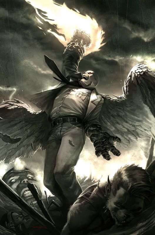
The thing with vert sigs is that you still need to keep one main focal, which is sort of hard to do. I find that my eye is dragged around in this piece.
The effects seem sort of random, in some parts they're fine, but in others they seem sort of random and misplaced.
The blending isn't to bad, but it's over-done in some places (his head for example), and this takes away from the part that should be the focal. It's also over-sharpened in some areas.
Text could do with a bit of work. And I don't even know why you gay tooled around his arm.
The slight patches of blue you've added in help, but you could have mixed it up a little more, it's a little monochromatic right now. Maybe use it a little stronger next time.
Depth could also do with a bit of work.
And finally, the lighting. It's pretty off right now. Maybe try looking at the stock to see how the lighting should go. That way you have something to base your lighting off of.
Vertigo- Administrator
- Posts : 91
Points : 134
Join date : 2010-01-31
Location : Texas
- Post n°14
Re: C&C my most recent work!
Thats the C&C I needed. Thanks mlp <3
|
|